Apple reaches people all over the world.
How do we design experiences that consider the full spectrum of human diversity?
I consider these key themes in my workflow.
🧏🏽
Vision & Hearing
Our creative team is in constant alignment with Design Systems to ensure that we’re using the appropriate and accessible colors, type sizes, and interactions throughout our project timelines. We also work closely with our copywriters and engineers to ensure that the experiences translate with screen readers and voice-over functionality.
🌍
Language
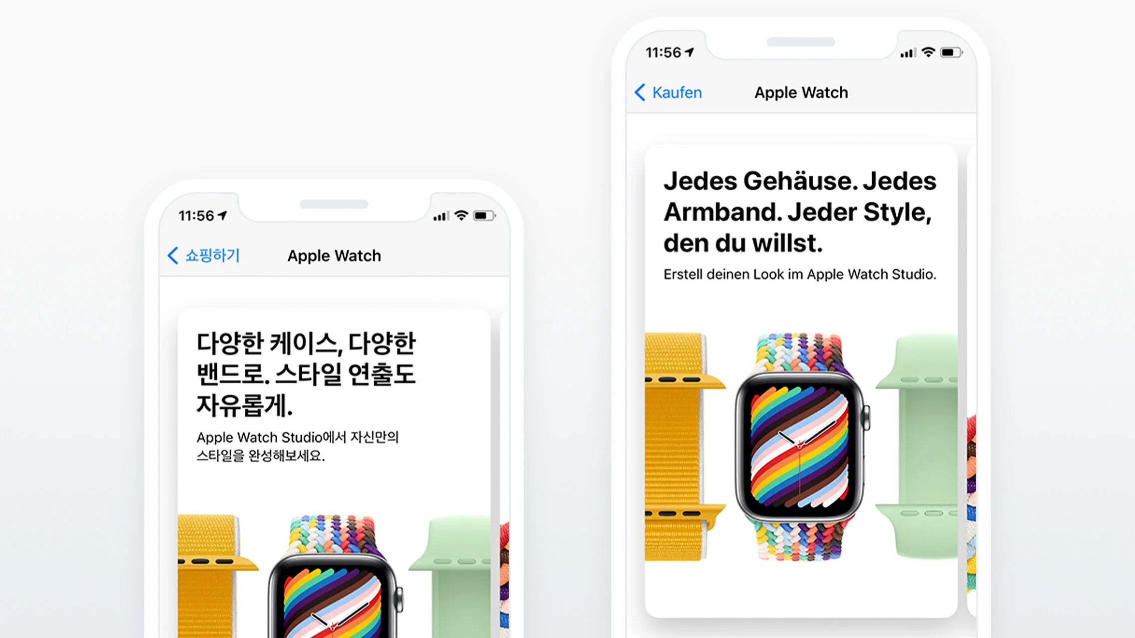
While we design in American English, we have to consider how the work translates to other markets. When text is translated into German, it’s often much longer than English. Arabic-speaking countries require text to be read right to left. I have to consider how our designs must scale for these nuances. And for multi-language markets like Canada (English/French), I have to ensure that there is functionality to flip between languages.
🧧
Culture
Each market has unique nuances in the way they interact and perceive designs. Working with experts for different locales helps ensure that we are aligning to specific behaviors and customs. For example, China has a much higher adoption in shopping on mobile when compared to the US. Paying for products via installment plans is a commonplace in India.
🧓🏽
Age & Tech Proficiency
Throughout the design process, I often ask myself — would my mom be able to navigate this? As someone in her 60s with rudimentary English, she’s someone who is intimidated by technology. This exercise always pushes me to not design only for the tech-savvy millennial but for the moms all over the world. 🤍
🔍
Wayfinding & Assurance
People learn how to use products in different ways — some like to have complete freedom, being able to explore, experiment, and figure things out on their own. While many struggle with having complete freedom, and need more guidance in their journey. I always consider how to provide support for those who need it, and stay out of the way for those that don’t.
💳
Financial Status
This last one is the trickiest of all — because of course, Apple is known as a premium brand. Many shoppers aren’t ready to drop $1,000 on a purchase. How do we elevate accessible payment programs and ensure that we’re not excluding price-conscious buyers.
And here are a few highlights.
AirTag
Apple Store App. Ensuring text on product tiles can scale and accommodate accessibility type sizes.

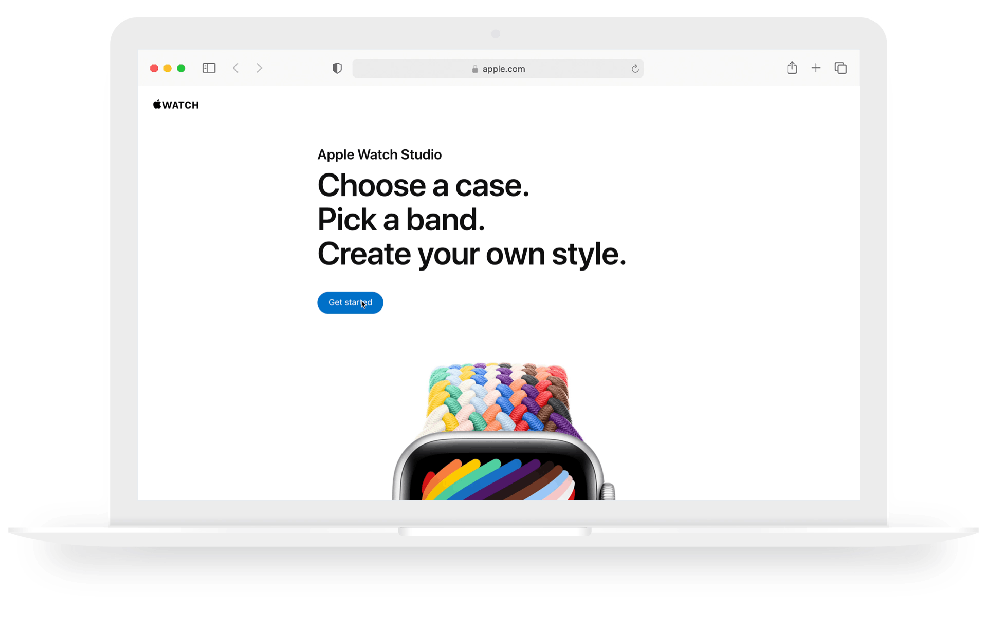
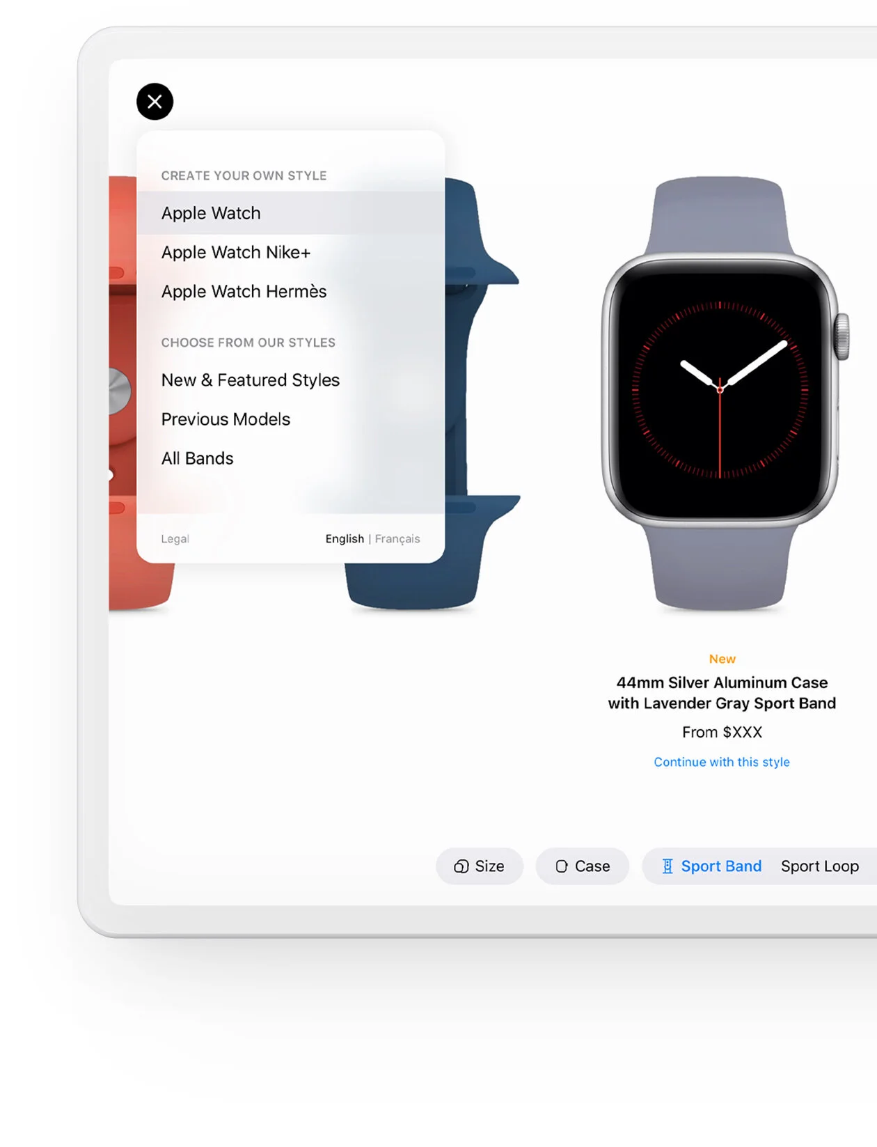
Apple Watch Studio
In-Store Platform. Including a toggle within the menu to allow in-store shoppers to switch to the language of their choice.
Ways to Buy iPhone
Apple Online Store. Ensuring the design system can accommodate right to left text when translating to Arabic.


Gifting & Engraving
Apple Online Store. Adjusting creative to align with regional customs. In China, the color red is associated with good fortune and is commonly associated with gifts.

Apple Watch Studio
Apple Online Store. Leveraging guiding copy for shoppers as they launch the experience. And including a subtle animation to teach the user how to interact with the tool.