DATE
3-Week Sprint
January 2019
CORE TEAM
Tony Nguyen, UX
Peter Kaoud, UX
Sylvia Benn, Copy
Jade Jariya, Art Director
Hannah Marshall, Design
About iPhone Pricing App
All demo devices at Apple Retail stores allow visitors to get hands-on with the product and freely explore its software. Upon initially unlocking a demo iPhone device, users get a snapshot of the phone’s price and have the ability to discover tech specs or compare features and details between current and previous models.
About 25% of all visitors interact with the Pricing App. When surveyed, only about 60% of visitors who interacted with the iPhone Price App found it easy to understand prices and compare models. Understanding prices was the lowest rated attribute across all hero products. Our goal was to make this process easy and elegant.
This case study is an example of a high-profile sprint that launched in all Apple Retail locations worldwide.

Existing Interstitial Screen

Existing Pricing Index Screen

Existing Model Compare Screen
Business Goals
Drive sales of iPhones in-store.
Promote the Trade-In credit program.
Help customers navigate our payment options.
Alleviate the traffic going to Specialists (store employees).
The Brief
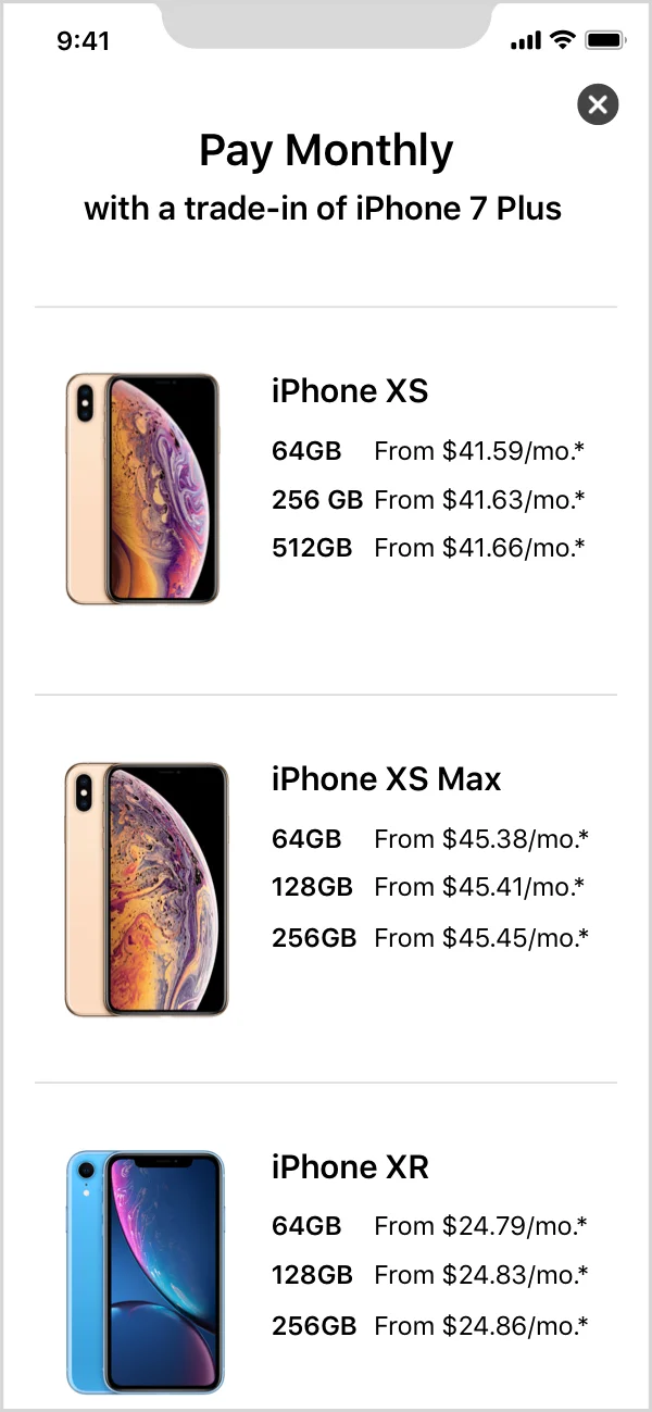
Leverage the lowest pricing option to attract prospective iPhone customers to purchase and existing iPhone owners to upgrade. To do so, display the monthly pricing amount for customers trading in an iPhone 7.
Upon receiving the brief, the creative team and I had a ton of questions. Considering that only a small subset of visitors had an iPhone 7, why would we display static pricing for this specific trade-in device? How would we communicate this for visitors to quickly understand how to get to the pricing that mattered to them? Why bury the full price — arguably the easiest way to understand and compare prices — so far deep into the app (on Tech Specs)?
I took a step back and tried to consider the mindset of Apple Retail store visitors and prospective iPhone buyers. How do we create a solution that addresses their intent?
Customer Goals
To find personalized pricing options in order to make an informed purchase decision.
To opt in or out of the Trade-In program.
To choose their preferred payment method (monthly, trade-up, full).
To compare all pricing options.
It was clear that the customer goals were at odds with the brief. Rather than to simply follow the instructions prescribed by the brief, my job as the UX designer is to create an elegant solution that considers both the business and customer goals. I had to challenge the stakeholders’ ask.
The Proposal
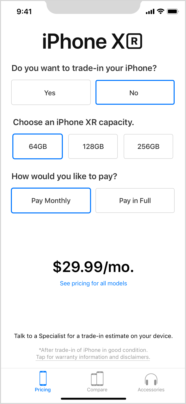
Add functionality that allows customers to opt in or out of the Trade-In program.
Allow customers to dynamically change their trade-in device and preferred payment method.
Reduce the need for customers to dig deeper into the compare page to see full pricing.
In sum: make the “Pricing Index” screen work harder.
The Initial Approaches
1 - Button Selections
Pros
Users can customize every option.
Easy access to all selections.
Customers can get to the exact price they want to see.
Low learning curve.
Cons
Exposing all selectors can be a little daunting.
Can potentially overwhelm the customer with too many decisions.

2 - Accordian Selections
Pros
Initial landing screen is tidy.
Provides more white space around the most important element — the pricing.
The Trade-In choices are grouped to simplify the organization of decisions.
Cons
Requiring the customer to go in and out of a selection “space” will cause more tap interactions.


3 - Sentence selections
Pros
A more interesting and delightful typographic treatment.
Cons
A less ubiquitous design pattern so there may be a slight learning curve.
Requiring the customer to go in and out of a selection “space” will cause more tap interactions.


New Considerations
Across the next two weeks, these three approaches went through several internal creative and external cross-functional reviews. We gathered feedback from creative leadership and external partners after every review and made fast iterations as we moved through the tight timeline. We often learned of complications that added new complexities we had to consider in our solution. Below is a quick summary of feedback, new features, and complications we considered in our new approach:
Interaction Patterns. While the buttons of selectors of option 1 were easy, we wanted to reduce the number of immediate decision points the user needed to make. The swipe-able tiles in option 3 was an elegant touch-friendly interaction that also allowed us to reduce the amount of content in screen.
Geo-Localization. Different countries have varying payment options so our system needs to easily compress and scale the number of payment methods. Additionally, we have to consider locations that have two national languages and an easy way for customers to toggle between them.
Compare Grid. The compare functionality must allow customers to be able to choose their own models — in other words, we have to include older models that we no longer sell in store. Because of this, including pricing in this compare grid leads to a clunky experience, especially with all of the payment options.
Legal Requirements. Each payment type has unique legal requirements that we need to display. We needed a simple and dynamic way to display legal copy.
The Final Designs