Date
Summer 2019
Core Team
Tony Nguyen (UX)
Lauren Camphyn (Art Direction)
Alexander Geller (Design)
Sean Johnson (Copy)
About
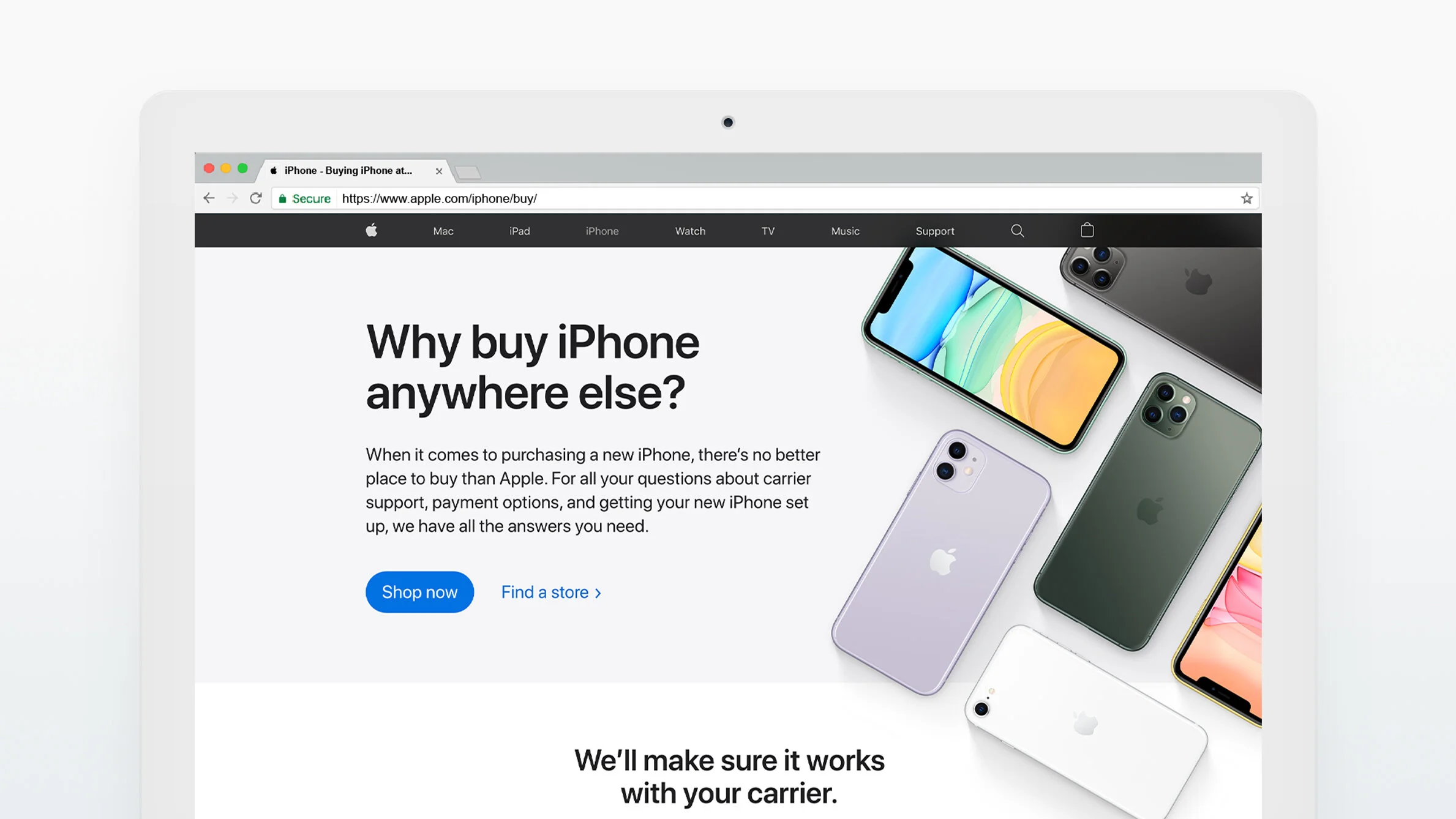
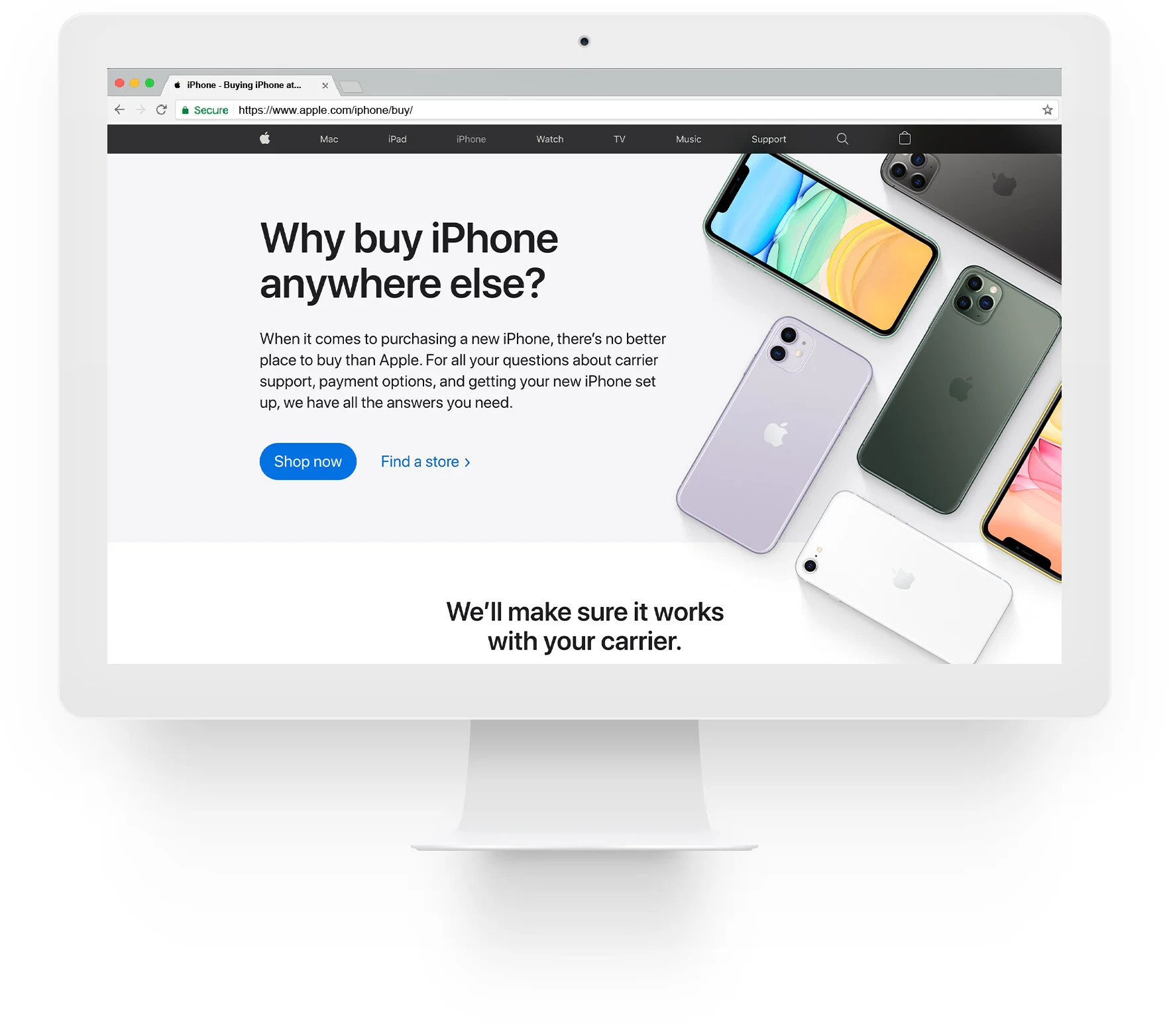
With the introduction of iPhone 11 and iPhone 11 Pro, our team needed to redesign many touchpoints across apple.com. One of the highest ranked landing pages on Google Search for “buy iphone” hadn’t been properly redesigned in years. We had an opportunity to restructure the narrative of this page to help prospective iPhone buyers gain confidence that Apple is the best destination to purchase.
The Problem
Customers see Apple Retail as the destination to learn about iPhone, but are unaware of the benefits of buying through Apple Retail (both online and in-store).
Customer Pain Points
Customers have trouble choosing the phone that’s right for them.
Customers are unaware that a new iPhone from Apple can work with their existing carrier.
Customers are unaware that we offer affordable buying options, similar to channel partners.
Customers expect setting up a new phone to be complicated and time-consuming.
Our Mission
Help customers feel more confident about buying their next iPhone from Apple Retail.
The Ecosystem
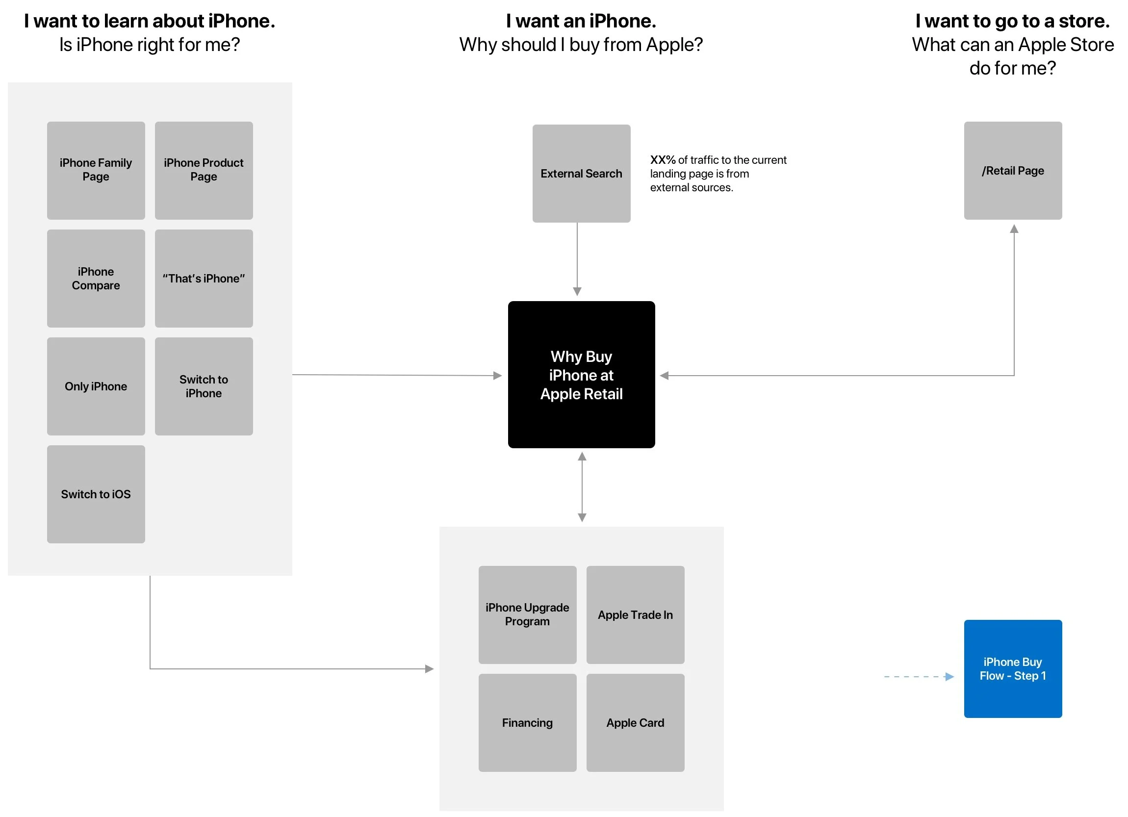
I began by mapping out all of the various iPhone touchpoints on Apple.com. I wanted to review how all of these destinations related to one another as well as how it connect back to the customer journey. Some pages appeal to customers higher in the funnel — a browsing and learning moment. I paid particular intention to destinations that are meant for customers with higher purchase intent.
Our Unique Value Propositions
If our goal is to help iPhone buyers build confidence that Apple is the best place to buy iPhone, I wanted to identify the key benefits of shopping at Apple and how we can differentiate ourselves from our channel partners (eg. resellers like Best Buy and carriers like AT&T, etc.).
I grouped each of these topics into themes, which naturally lended itself to categorizing by customer journey:
Decision support (I need help choosing)
Buying options (I know what I want, how can I pay)
Setup support (What happens after I buy)
Additionally, these groupings also tie back to the customer pain points highlighted at the top of this page. This framework ultimately helped me define the content strategy and narrative of this landing destination.
Content Strategy Explorations
Given what we know are key differentiators for Apple Retail as well as the information that most prospective iPhone shoppers are looking for, I created three different narratives to structure the page content.
1. Simple Editorial
Quick and easy to understand.
Doesn’t allow flexibility in routing visitors to different destinations.
2. Sectioned Q&A
Sections headers provide help context and groupings.
Q&A structure mirrors the experience of talking to Specialists in-store.
Final Wireframe
After a couple rounds of feedback from various stakeholders and partner teams we locked in our preferred content strategy and built the final wireframe. Some considerations and decisions:
People resonated with the structure and conversational flow of approach 2.
We maintained the Q&A format and introduced thumbnails of real Specialists to pair with each “response”.
We continued the theme of service and support through out the entire page to ensure that visitors can get help at every moment of the journey.
Because the biggest iPhone customer pain point is around carrier activation, we separated the middle section into two distinct categories: carrier support and payment options.
We added an Apple Card question to the payments section because customer feedback surveys show that many are confused about the benefits of Apple Card and how to apply.
Lastly, for those who have already have a sense of which iPhone they want, we wanted to end the page with a router to quickly jump into the buy flows of specific models.
The Final Visual Design
Click below to view the full design.


